Friday 9 January 2015
Wednesday 7 January 2015
OUGD601: ASICS brief: Final Designs
Below are the final products that I designed:
Brand Guidelines
Website


App


Brand Guidelines
App
Adverts
Mock ups
Monday 15 December 2014
OUGD601: ASICS brief: Initial Ideas and Development
The re brand will look at 6 areas; Logo, brand guidelines, advertisement, website, app and mock ups. The design needs to be consistent through out so that the brands identity is strong.


After I designed the type and played around with different versions, I chose the one that I thought best suited the brand. I still wanted a logo as I felt the type by itself wasn't strong enough. I took the logo into photoshop and slanted the letters so it was in italics, I then started playing around with shapes and colour.


After developing the logo I came up with an idea that I thought worked really well. I felt like the logo showed speed and efficiency, and as a sporting brand thats what they are all about. I left colour out of the logo, which allowed me to use the logo across all platforms. The letters a made bold so that the logo would stand out.
Final Logo


I chose these colours below as the final colours. The yellow was the main colour, I felt like it mirrored the colour of reflective running gear. The colours all work really well together, and can be used on top of each other without looking to garish.

I made the brand guide lines bold and simple, whilst portraying the new identity of the brand.


After getting an initial template I started adding the contents. I produced a pattern out of the dot on the I of the logo. The pattern coincidentally looked like the pattern on a shoe, which fit perfectly with the identity.


Here is the final set of brand guidelines I produced:
Website & App
For the website and app I just designed the home page, to show how the identity can be applied online. I wanted the website to be completely changed from the original. I wanted lots of colour and high quality images. The site needed to actually make people want to engage with it.


I made the website bold, clear and easy to navigate round. The adverts really engage the user with bold colours and text drawing you in.

The app was designed to mimic the website, put designed into a format that would be applicable to a mobile phone. Again the app shows how the identity is applied across all platforms.


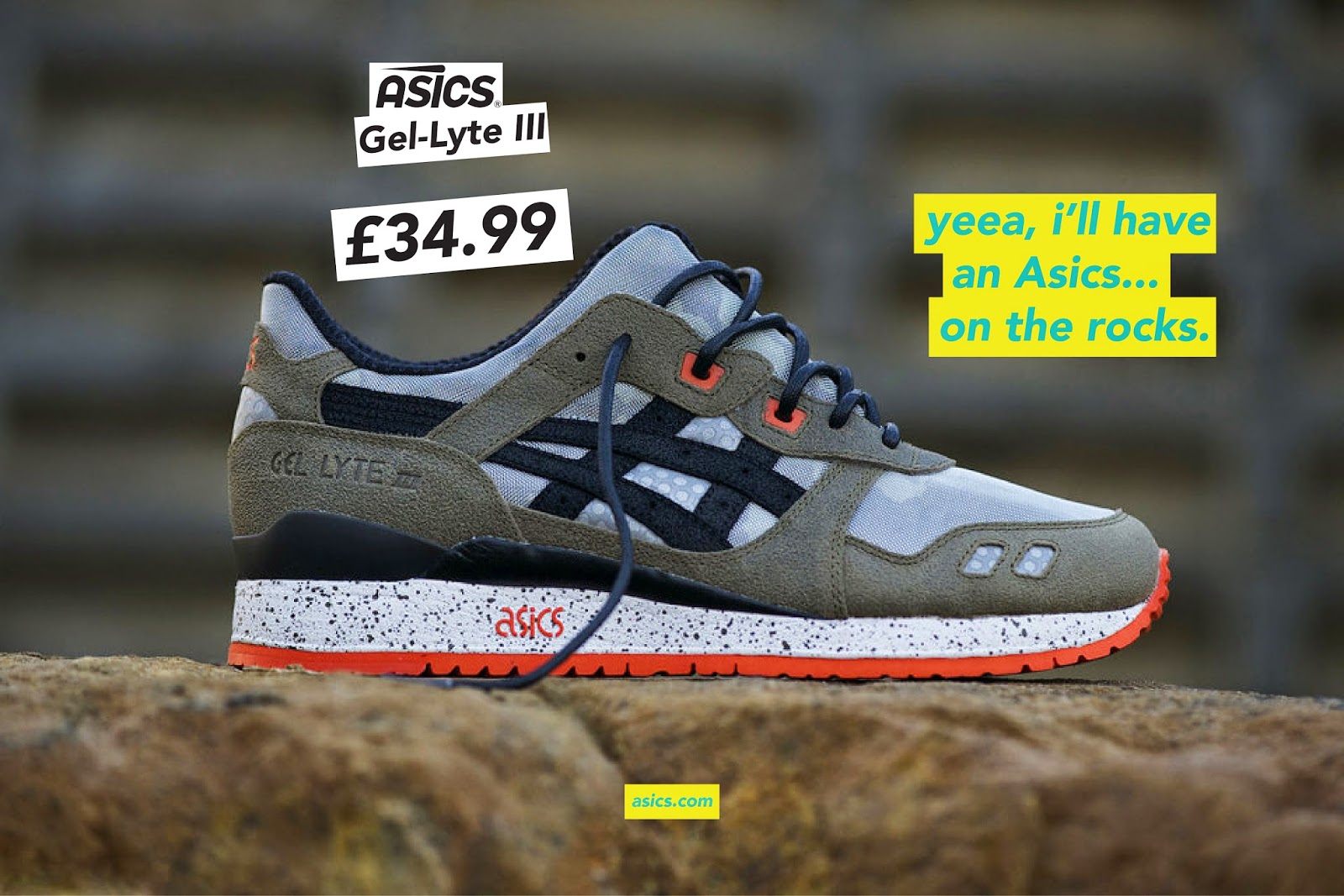
Posters
*The images used for the posters were taken from the ASICS website and I am in no way taking them as my own, I added the text.
I kept the adverts simple, I wanted to create quite a humorous narrative with all of them. I think coming across in quite a joking manor is much more approachable to 16 - 25 year olds than being serious. I used colloquial language, and matched the appropriate colour to the shoe.


The images used were perfect for how I wanted to come across, they are colourful, high quality and focus on the subject.

The logo
So I initially took the original logo and tried to develop it and change it into something that would be more appealing for the audience. I sketched a few ideas but couldn't get a logo down that I thought was suitable. I thought maybe making the logo 3D with grain to add depth.
So I initially took the original logo and tried to develop it and change it into something that would be more appealing for the audience. I sketched a few ideas but couldn't get a logo down that I thought was suitable. I thought maybe making the logo 3D with grain to add depth.
Initial Ideas
After sketching out my ideas I started to develop them on illustrator. I was able to use the shapes to create my own font that I used to spell out ASICS. The designed the font so that it was bold and looked powerful.
After I designed the type and played around with different versions, I chose the one that I thought best suited the brand. I still wanted a logo as I felt the type by itself wasn't strong enough. I took the logo into photoshop and slanted the letters so it was in italics, I then started playing around with shapes and colour.
After developing the logo I came up with an idea that I thought worked really well. I felt like the logo showed speed and efficiency, and as a sporting brand thats what they are all about. I left colour out of the logo, which allowed me to use the logo across all platforms. The letters a made bold so that the logo would stand out.
Final Logo
Brand Guidelines
After developing my logo I started on designing my brand guidelines, I wrote a list of what I wanted in them, and developed this list into sketches.


Before starting to design my brand guidelines I wanted to choose a colour swatch that would be appropriate for the brand. I had to bare in mind that the brand targeted both male and female.


After developing my logo I started on designing my brand guidelines, I wrote a list of what I wanted in them, and developed this list into sketches.
Before starting to design my brand guidelines I wanted to choose a colour swatch that would be appropriate for the brand. I had to bare in mind that the brand targeted both male and female.
I chose these colours below as the final colours. The yellow was the main colour, I felt like it mirrored the colour of reflective running gear. The colours all work really well together, and can be used on top of each other without looking to garish.
I made the brand guide lines bold and simple, whilst portraying the new identity of the brand.
After getting an initial template I started adding the contents. I produced a pattern out of the dot on the I of the logo. The pattern coincidentally looked like the pattern on a shoe, which fit perfectly with the identity.
Here is the final set of brand guidelines I produced:
Website & App
For the website and app I just designed the home page, to show how the identity can be applied online. I wanted the website to be completely changed from the original. I wanted lots of colour and high quality images. The site needed to actually make people want to engage with it.
I made the website bold, clear and easy to navigate round. The adverts really engage the user with bold colours and text drawing you in.
The app was designed to mimic the website, put designed into a format that would be applicable to a mobile phone. Again the app shows how the identity is applied across all platforms.
Posters
*The images used for the posters were taken from the ASICS website and I am in no way taking them as my own, I added the text.
I kept the adverts simple, I wanted to create quite a humorous narrative with all of them. I think coming across in quite a joking manor is much more approachable to 16 - 25 year olds than being serious. I used colloquial language, and matched the appropriate colour to the shoe.
The images used were perfect for how I wanted to come across, they are colourful, high quality and focus on the subject.
Subscribe to:
Posts (Atom)